In the early 1980s, when prep and power dressing dominated the American landscape, a few Japanese designers were preparing for a revolution. In the West, many of our trends in literature, architecture, and fashion derive from the Regency era. We wear navy suits because, in the early 19th century, British men of means paired navy coats with cream-colored breeches. About a generation later, Regency blue gave way to Victorian black when Queen Victoria decided everyone should look somber. Nearly 200 years later, these norms remain. Most men today wear navy, black, grey, and white — following in the steps of those early-19th-century traditions — and pair navy coats with lighter colored trousers because of Beau Brummell.
For a select few, this all changed in 1983 when Rei Kawakubo and Yohji Yamamoto debuted their now-legendary spring/ summer collections in Paris. Thoughtlessly dubbed the “beggar’s look” by critics, these so-called rags were quite calculated in their design. Their asymmetric, deconstructed, and artfully ripped clothes enshrouded their wearers in mystery. As Yves Saint Laurent noted, fashion in the early 1980s was all about color and lots of it. These Japanese artists, on the other hand, deliberately avoided vivid color and made heavy use of a monochromatic palette, from “strong and varied hues of black to the simplicity and crispness of shades of white.”
“Kawakubo’s and Yamotmo’s black was often an unassuming, harmonious shade, reminiscent of Japanese ink painting,” wrote the authors of Future Beauty: 30 Years of Japanese Fashion. “Their expressive use of a black palette also partook of the qualities celebrated in Jun’ichirō Tanizaki’s book In Praise of Shadows (1933), which finds in shadow the essence of the Japanese aesthetic and speaks of the Japanese skill with light and shade. The designers’ choice of color, unfettered by any Western paradigm, was perceptively singled out by The Washington Post as the distinguishing feature of their style, along with the purity of their aesthetic. The French newspaper Libération likened Kawakubo’s and Yamamoto’s creations to their intense black-and-white films of Kenji Mizoguchi, while French Vogue compared them to calligraphy scrolls, which symbolize a beauty devoid of color.“
What is it about low-contrast ensembles that give them such power? Black has always hinted at something mysterious and powerful, but even cream-on-cream tonal looks feel sophisticated. By stripping away contrast, Japanese designers reduce everything to zero and force you to focus on the purity of their lines. The look has a certain flatness, certitude, and honesty. In a passage from Moby Dick, Herman Melville expresses this beautifully through his character Ishmael, who declares:
When we consider the theory of natural philosophers, that all earthly hues — every stately or lovely emblazoning — the sweet tinges of sunset skies and woods; the gilded velvets of butterflies, and the butterfly cheeks of young girls; all these are but subtle deceits, not actually inherent in substances, but only laid on from without; so that all deified Nature absolutely paints like the harlot, whose allurements cover nothing but the charnel-house within; and when we proceed further, and consider that the mystical cosmetic which produces every one of her hues, the great principle of light, forever remains white or colorless in itself, and if operating without medium upon matter, would touch all objects, even tulips and roses, with its blank tinge — pondering all this, the palsied universe lies before us […]
In other words, Melvill/ Ishmael can be understood as saying that earthly hues are but “subtle deceits” and objects themselves do not possess any colors; instead, they are “laid on from without.” Vivid colors and contrast are dazzling, but they’re self-indulgent and dishonest. In fashion, they distract you from the true glory of an outfit: the silhouette.
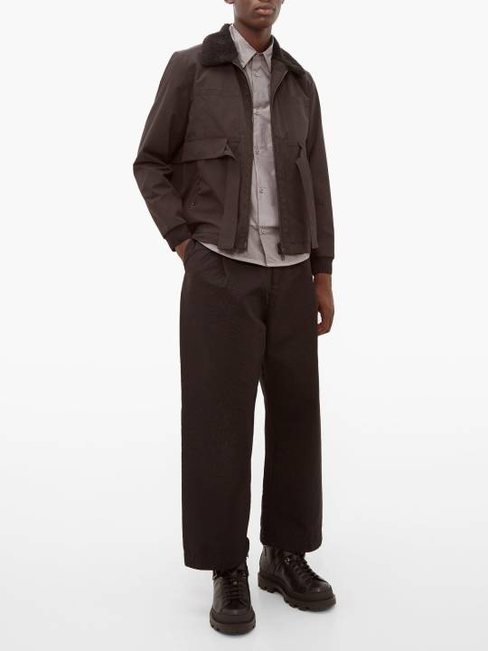
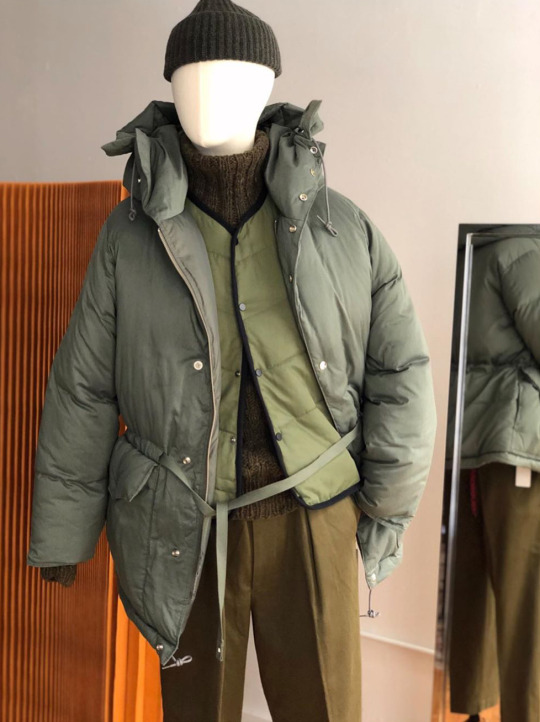
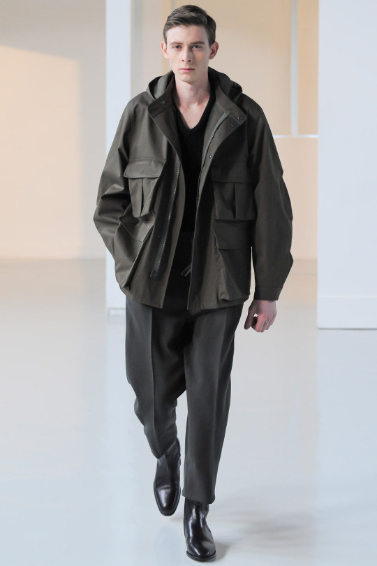
Even if you don’t wear avant-garde fashion, there are lessons here to be learned. A low-contrast combination can be a much more sophisticated way of making a statement than wearing loud colors or patterns. It’s also easier to pull off since most men feel limited in terms of their color palette. Palewave, which is a ‘90s-influenced aesthetic that’s grown as a reaction to modernist streetwear, is about exclusively relying on light colors and minimal contrast. Darkwave, a scientific term I just made up, is the opposite. This is the world of laboratory carbon, where clothes look like they’ve emerged from a darkened antechamber and are making their way into icy-crisp winter daylight. Palewave is ethereal; darkwave is ominous. Both concepts can be used to great effect across a range of wardrobes — from tailored to casualwear. Here are some examples of how you can dial things back this fall/ winter.
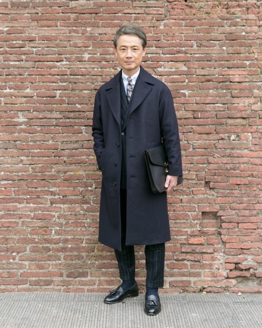
MATCH YOUR COAT AND TIE
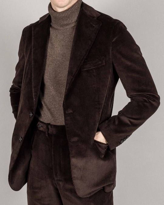
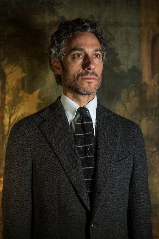
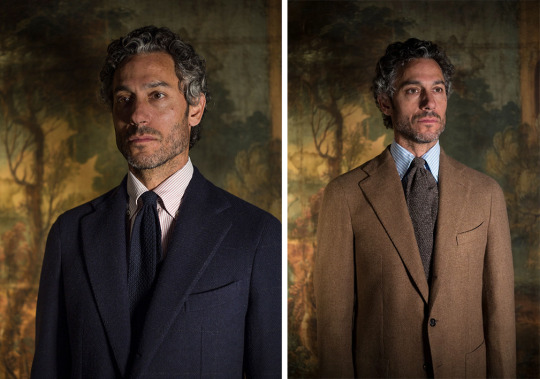
For men who look upon low-contrast ensembles with suspicion, an easy way to create a conservative version of this look is by matching your coat and tie. If you’re wearing a navy suit, choose a navy tie in a similar hue and shade. The same goes for earthy olives, muddy browns, and slate grays. Fall/ winter is a great time for these kinds of combinations because of the rich varieties in seasonal neckwear. With a brown tweed, go for a brown ancient madder tie and tan whipcord trousers. With a navy suit, pick up a tie made from navy Donegal or wool crepe.
Jake Grantham of Anglo Italian often wears this kind of combination to great effect. His store’s lookbook, freshly released just a couple of weeks ago, is full of such inspiration. “We don’t like ruddy browns or purple-y reds. We like colder colors that are easier to wear — steel blue, cold gray, and neutral olive,” Grantham recently told me. “Fabrics are always matte and often textured. The secret is in how you combine those things: the cut, design, colors, and textures. That’s how you can update the look.”
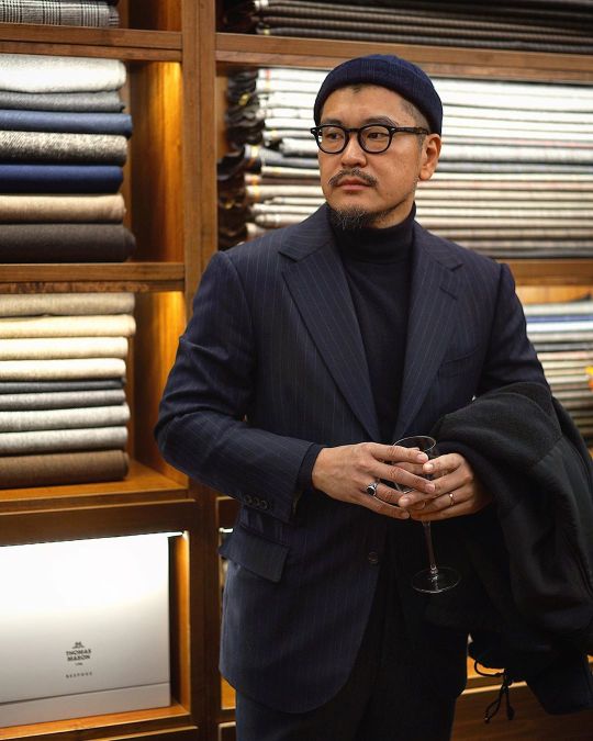
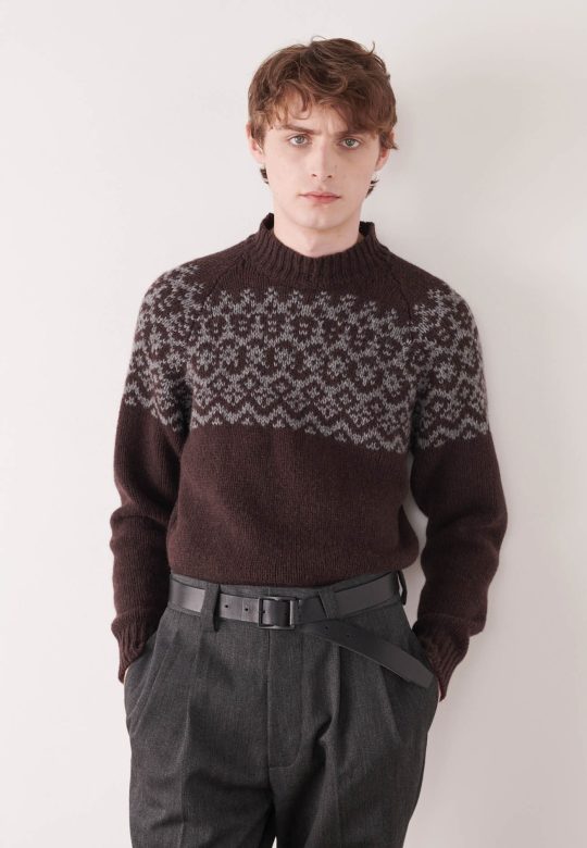
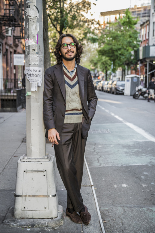
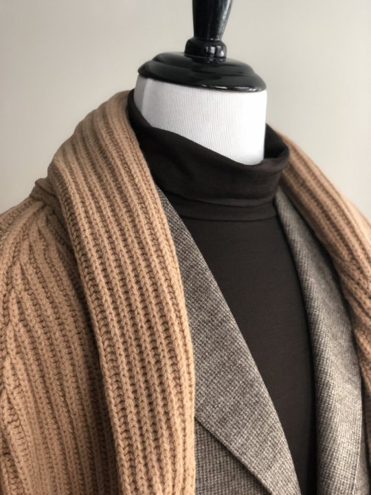
CHOOSE A TONAL KNIT
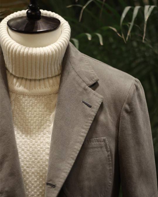
If you don’t wear ties often, choose a tonal sweater. A matching knit can be a great way to both dress down a tailored jacket, as well as create a tonal look without having to fuss over shirt-and-tie combinations. If you’re wearing a sport coat, riff off the primary color in your jacket by varying the shade of your sweater and trousers. If it’s a rust-brown cashmere sport coat, wear a taupe turtleneck and khaki pants. With a charcoal herringbone tweed, complement your outfit with mid-gray wool trousers and a pearl grey crewneck.
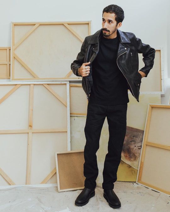
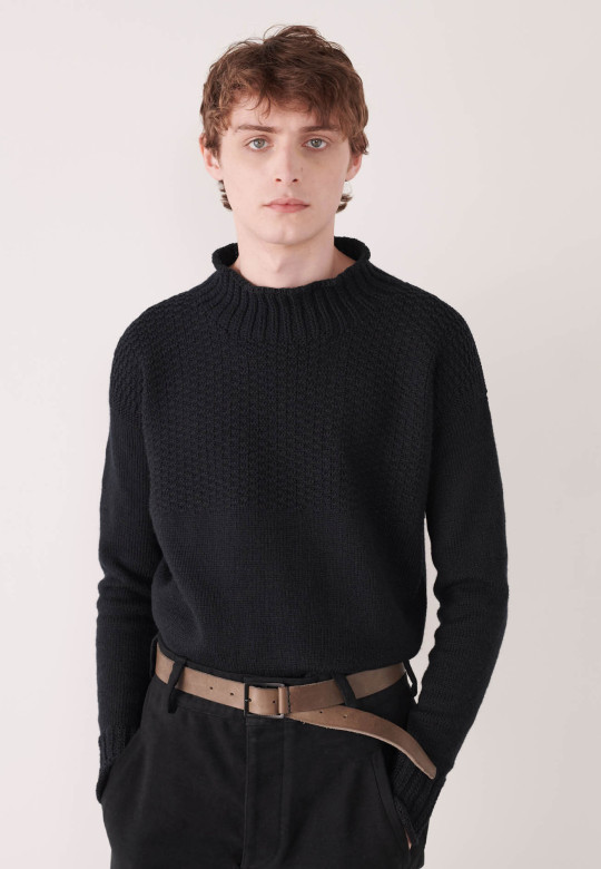
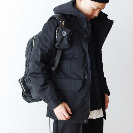
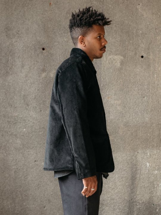
ALL BLACK CASUALWEAR
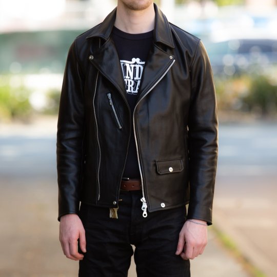
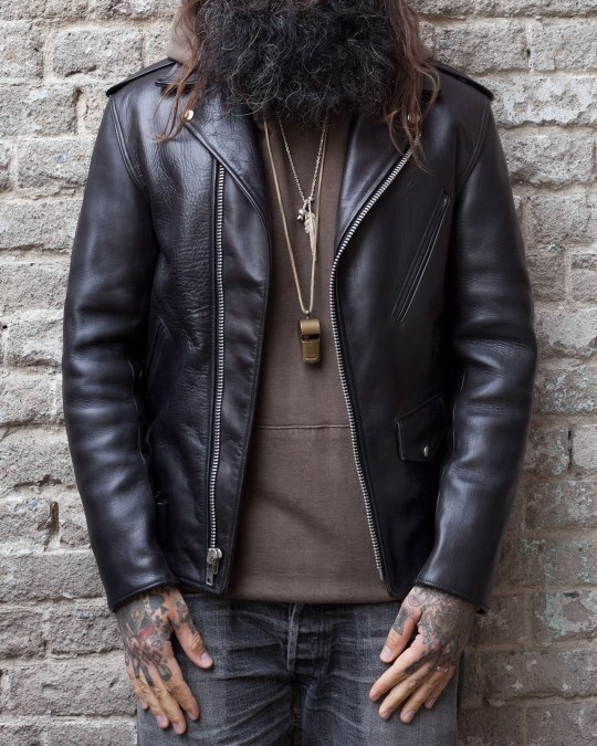
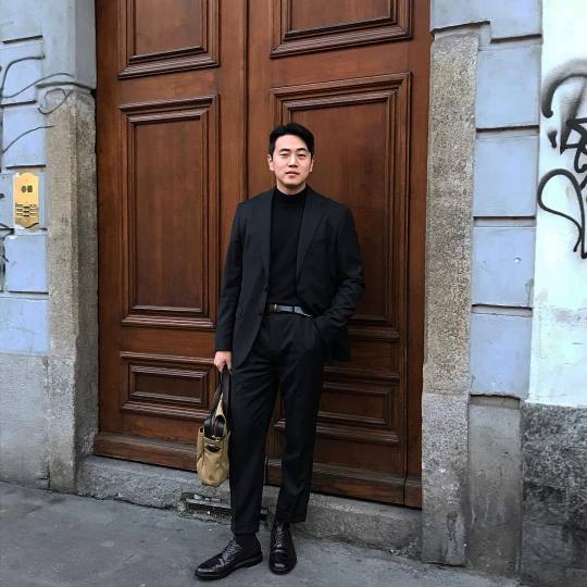
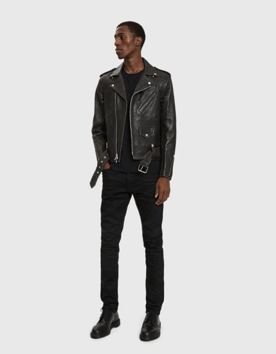
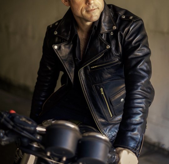
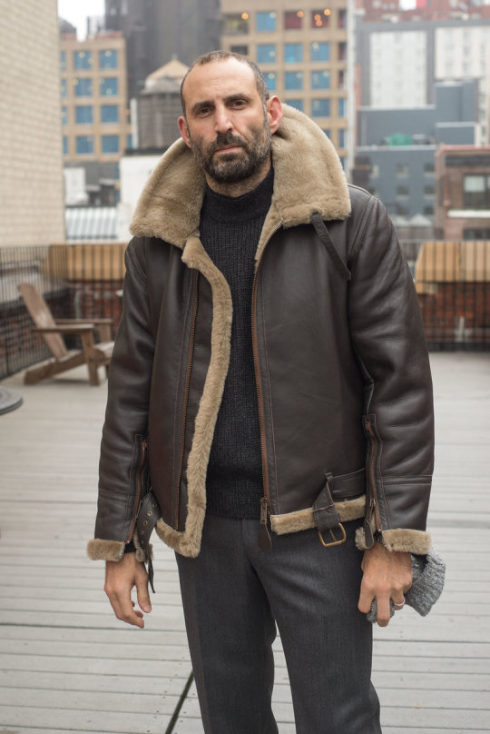
For a more casual look, there’s nothing easier than wearing all black. Since the late 1970s, midnight black outfits have been associated with a certain kind of New Yorker – fashion people, artists, and cool downtown types. Designers such as Donna Karen also heavily relied on the color for its practical applications. Black is flattering, slimming, and easy to mix-and-match. Plus, the color has long connoted power, elegance, and even sexiness. When asked why the hue is considered verboten for so many classic menswear dressers, Alan Flusser told The Rake: “Black can be very chic, and guys who are into tradition or ‘sartorial’ style are generally not into chic.”
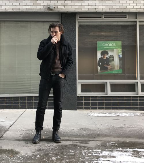
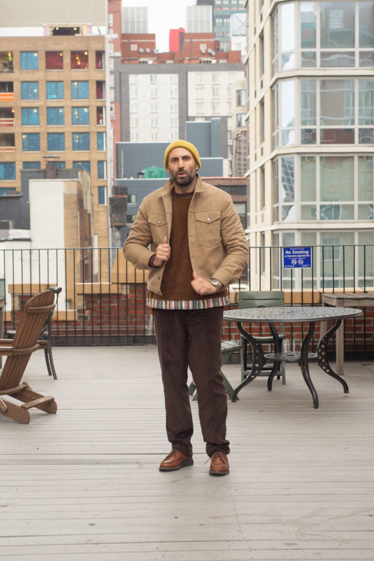
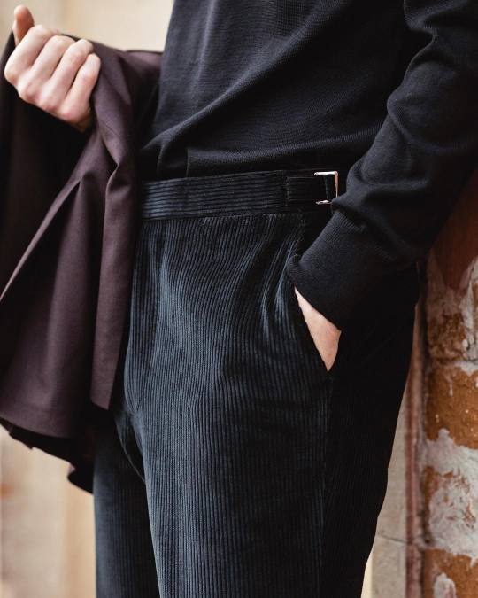
The key here is to get your contrast from something other than color, such as fiber, texture, or sheen. Wool, linen, and cotton all reflect light differently, which gives them different levels of visual depth. If I’m in a rush, I’ll often put on a black Margiela leather jacket with black boots, black jeans, and a long-sleeved black tee. If that feels too severe, a white or eggplant-colored tee can be an excellent substitute. I also recently bought these black corduroy Kaptain Sunshine pants to wear with a black topcoat.
Of course, midnight fabrics can be dyed in a variety of ways, each of which will have its advantages. Reactive dyeing results in a longer-lasting, deeper black, but it’s expensive and thus not often used. Iron Heart calls its reactive black denim “Super Black” because it doesn’t fade easily. Alternatively, black can be sulfur or acid dyed (sulfur is used for cotton, while acid is used for wool). Since these dyes don’t bond as strongly with fibers, the resulting material is less stable. “Our double black jeans are sulfur dyed,” says Andrew Chen of 3sixteen. “For people who like fading, like me, sulfur is the better choice and more affordable too.”
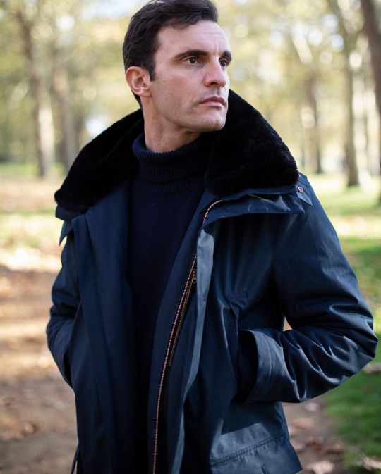
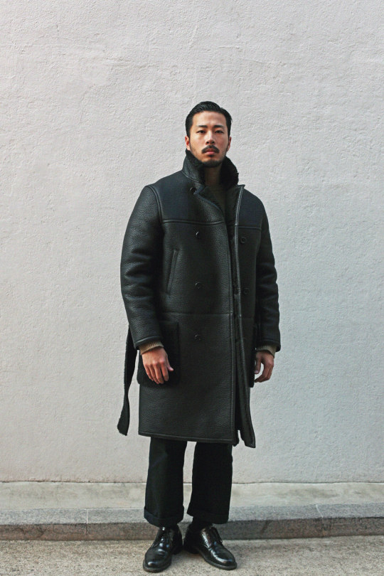
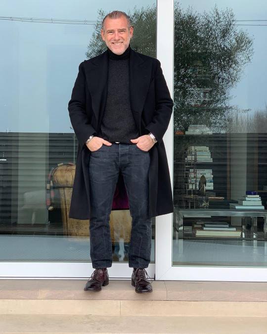
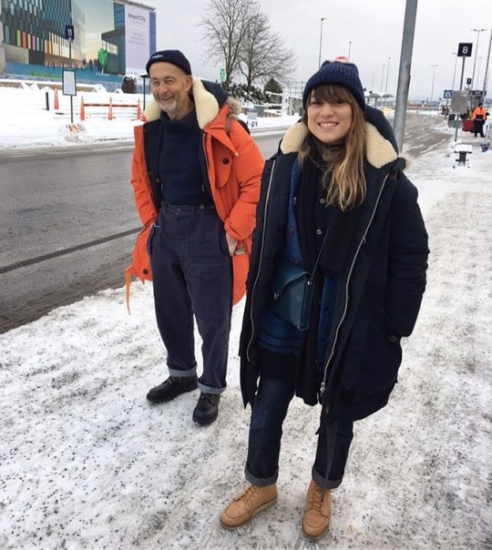
CREATE A BLACK BASE
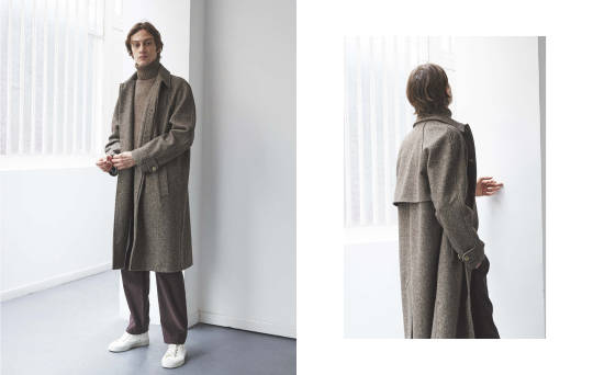
Here’s an old trick stylists often use on the runway. When layering, create a black base by pairing black or charcoal pants with a matching top. Then layer anything you want over this: a charcoal herringbone topcoat, olive milsurp bomber, or navy raincoat. The black base underneath acts as a backdrop for your outerwear, which can be useful for either statement pieces or to make a basic coat stand out. Designers often do this on the runway when they want to show off a particularly good design. You can employ the same in an everyday ensemble.
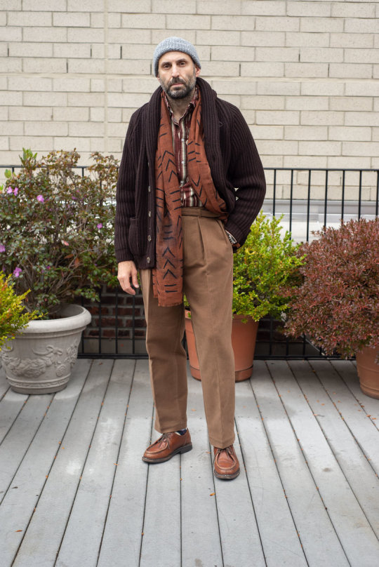
Greg Lellouche, founder of No Man Walks Alone, a sponsor on this site, shows how you can do this with a bomber jacket. In the photo above, he’s wearing an Inis Meain ribbed mock neck sweater with Rota whipcords and a James Grose RAF shearling jacket. Not pictured are his Heschung Tyrolean shoes in expresso calf, although you can also use black field boots for a more tonal ensemble.
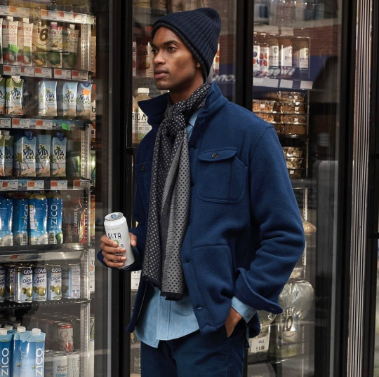
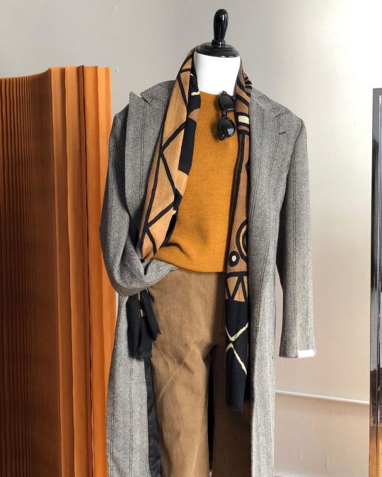
USE CONTRASTING SCARVES
Sometimes things don’t go your way. If a low-contrast or tonal ensemble doesn’t feel right, use a contrasting scarf to break up the look. The photo from Freeman’s Sporting Club above shows how you can layer blue chinos with a light blue work shirt and a matching navy jacket. On its own, the outfit can feel a bit monotonous. But when you layer in the grey scarf, everything comes together — it’s tonal, but not flat. I find heather gray scarves to be particularly useful for this kind of thing. They go well in outfits that heavily rely on blue, black, and charcoal. With brown, I prefer burgundy.
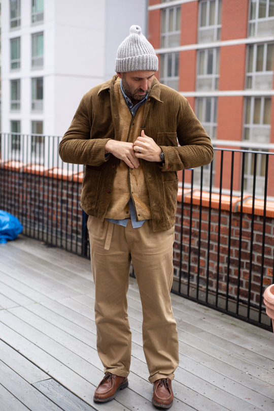
RELY ON PATTERNS
You can also break up an outfit using patterns. The rule for mixing patterns is simple enough: vary them by type and scale. If you’re wearing a pencil striped shirt, use a scarf with a large scale plaid. If your coat features big tartan, switch the scarf out for some non-repeating pattern (Drake’s is particularly good for this sort of thing). This avoids that terrible vibrating effect that can strain the eyes when there are too many patterns present. Things end up looking distinct.
Again, using the photo of Greg above, you can see how well this works with just two patterns. The dark brown Scott & Charters shawl collar cardigan features a big, heavy rib, which lends its own texture. Add to this the Doppiaa Southwestern flannel shirt, Doppiaa folk print scarf, Kaptain Sunshine Ghurka trousers, and Heschung shoes, and you have a very sophisticated tonal outfit. This navy Doppiaa scarf, would work similarly well in charcoal and navy heavy ensembles.
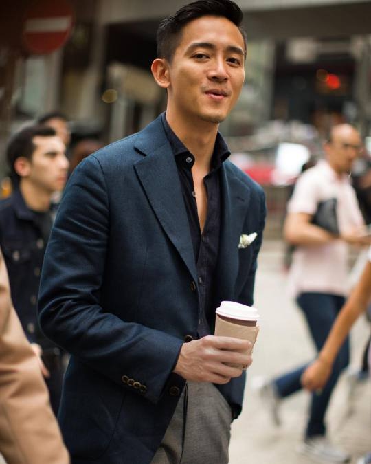
PICK UP A NAVY OR ECRU SHIRT
If you don’t already have the kind of wardrobe that allows you to create the looks above, here’s an easy and actionable step: pick up a dress shirt in navy or ecru. If you read this site, there’s a good chance you already have a navy sport coat or brown tweed, along with some grey flannel trousers or khaki chinos. Those are the kind of basics that form the foundation in any tailored wardrobe. To create a low contrast look, wear a navy shirt with your navy sport coat and grey trousers. Or an ecru shirt with a brown tweed and khaki pants. Doing so lowers the overall contrast, allowing you to get a sense of how you feel about these kinds of combinations.
The Armoury has some useful long-sleeved polos in three shades of dark blue for this sort of thing. Michael Spencer, a sponsor on this site, has the very rare ecru oxford. I also really like Proper Cloth’s inky blue oxford, Monti melange basketweave, tonal seersucker, and fine tan corduroy shirts. Get these with button-down collars. You generally don’t want to wear traditional neckwear against non-traditional shirt colors, and a button-down collar will stand up better on its own than spread collar varieties.