Spring for Barbour

image


I can’t help but to keep coming back to Barbour every season. This past fall/ winter, I picked up two pieces from their collaboration line with Norton & Sons, both of which have come into regular rotation. There’s this black Shetland sweater, which is wonderfully thick and hardy, and has a tightly knit ribbed hem to help it stay up on the torso. The sweater’s unusual texture adds some important surface interest when it’s layered underneath a simpler jacket. I also bought this waxed cotton field coat, which has two button-tabs at the back to give the coat some shaping, hidden storm cuffs to help keep the wind out, and two big pockets for stowage. I’ve been wearing it with beat up jeans and boots whenever the weather feels cold or wet.

As I’ve mentioned before, the problem with many of these pieces is that they’re hard to appreciate just through photographs. They lack the kind of unusual detailing that makes things popular on blogs or help catch a customer’s eye as he’s scrolling through an online store’s inventory. Instead, they focus more on simple designs and unique materials. The shell on my new field coat, for example, feels more interesting than the coated cottons I’ve handled from Apolis or Filson. Scuffs show-up more easily in the wax, which gives the coat some character, and the velvet collar, I suspect, will wear down beautifully over time.

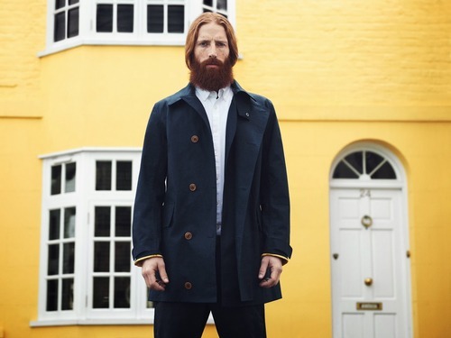
This season’s latest Barbour x Norton & Sons collection feels much the same – simple and handsome, although not always styled as well as it could be in marketing materials. There’s a long navy raincoat, for example, that’s often photographed with the front buttoned-up, which I think unfairly hides the “lapel” that softly rolls out when the jacket is worn open (above is the one photo I can find that shows this). There’s also a cotton/ linen Guernsey sweater with a subtle dropped shoulder that’s easy to miss. My interest in Guernsey sweaters (a type of fisherman’s knit) was piqued last year when I saw these photos of David Somerset and British fishermen. I might give this one a try this spring. 

Barbour has also introduced a new subline – called Spey – as part of their Heritage collection. Spey offers fly-fishing inspired jackets, colorful shirts, and lightweight Fair Isle sweaters. I admit, like Barbour’s Dept. B, some of these feel like cheap derivatives of Tokihito Yoshida’s work, although there’s an interesting fly-fishing take on the classic Bedale. In any case, I’ve included a great fly-fishing movie at the very end of this post, should you want to watch something beautiful and get romanced into liking Spey more than you should.  

Keep reading

1930s Esquire and Apparel Arts Illustrations

image


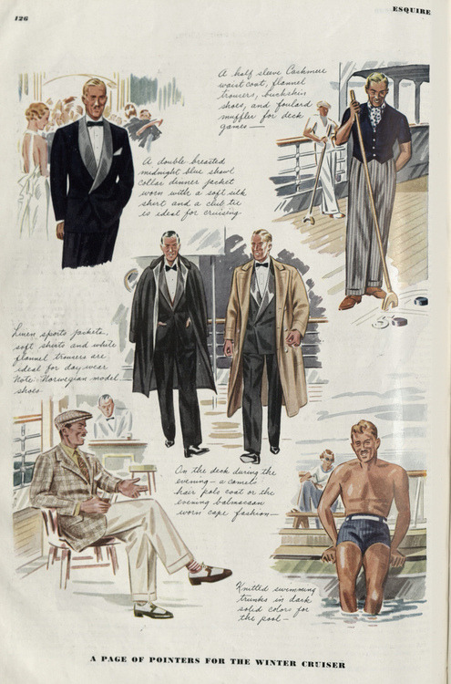
A friend of mine recently scanned some remarkable scans of old issues of Esquire and Apparel Arts, all originally published around the 1930s or so. Apparel Arts was a quarterly large-format publication, started by Arnold Gingrich, who was also the founder of Esquire. Where Esquire was aimed at the consumer, Apparel Arts was for the trade. You see, buyers who work for clothing stores today typically rely on lookbooks, tradeshows, and fashion magazines to decide what they should stock each season. This wasn’t so in the 1930s. Back then, small independent shops relied on Apparel Arts to figure out what the best dressed men wore, and consequently what they should offer to their customers.

For a number of reasons, the usefulness of Apparel Arts declined after the end of the Second World War, so it was transformed into GQ in 1957. One of the conspicuous things you’ll notice is that – along with scantily clad women – GQ today has small caption boxes listing the brands of the clothes they’re promoting. Fashion spreads will say things such as “Suit by Ralph Lauren $2,875; Shirt by Brioni $475; Tie by Zegna $185.” In Apparel Arts, there were no such captions. It was a publication simply about how to dress well given different settings.

It’s for this and many other reasons why men who enjoy classic men’s clothing often look back to  Apparel Arts with fondness. These illustrations are also some of the few examples we have left for what we mean when we say “classic men’s dress.” This is the coat-and-tie look worn without the twee-ness of the modern GQ, the frumpiness of Men’s Wearhouse, or the peacocking of Pitti attendees. Though, it’s perhaps good to mention that the styles shown here were also the peacocking of their day. A friend of mine once emailed me a funny cartoon from a 1935 issue of The New Yorker, where a man is shown at a swanky social gathering while dressed in a peak lapel, windowpane jacket; polka dot ascot; and patterned trousers. A pocket square is spilling out of his breast pocket, and people around him are seen whispering, “They say he reads ‘Esquire.’” A modern version of this cartoon might show people saying, "They say he’s a blogger.“ 

In any case, enjoy these illustrations. My friend scanned hundreds of them, but for the sake of brevity, I’ve only posted about fifty here. Colin McDowell penned a nice piece today at The Business of Fashion, where he talks about how fashion reporting has suffered greatly from the decline of fashion illustration. One needs to only do a search on Google Images for old Vogue covers to see what he means. These, in some ways, are the menswear equivalents. 

Keep reading

Josephine Baker Pocket Squares

image


In happy weekend news, Drake’s full spring/ summer collection is now available on their website. Included are some summer shirts made in their newly acquired Rayner & Sturges factory, as well as some ready-to-wear sunglasses from Nackymade. They’ve also expanded their colors for grenadines (now boasting many shades of green, brown, and blue) and broadened their line of shantungs. In addition, the unique fuzzy mohair tie they introduced last season seems to have been kept, and there are some basic repp stripes to satisfy their more conservative customers.

Perhaps most interesting of all is their pocket square line. There’s a handsome cotton animal print that I think would sit well in the pocket of any tropical wool or linen sport coat, as well as a spring/ summer version of their tile print design. I actually bought a couple of their tile prints last season and have found them to be incredibly useful. The print is unusual enough to not overly match any tie, but also conservative enough to not stick out too much on its own.

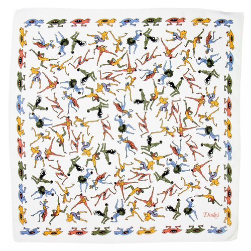
The best square of all might be the one honoring Josephine Baker – widely considered the “First Lady” of jazz and an important figure in the American Civil Rights Movement. Baker famously refused to perform for segregated audiences in the US, and had a not uncomplicated relationship with French society as a symbol of Black femininity. I’ve included a great documentary on her at the end of this post, should you want to watch some fascinating Black history. There are also some things over at The Phoenix Project dedicated to her, although those are aimed at women’s wear. 

Many thanks to Drake’s for not releasing a line of Bill Evans or Miles Davis pocket squares this season, for otherwise, I might have gone broke. 

Keep reading

A Cruel Cosmic Law

image


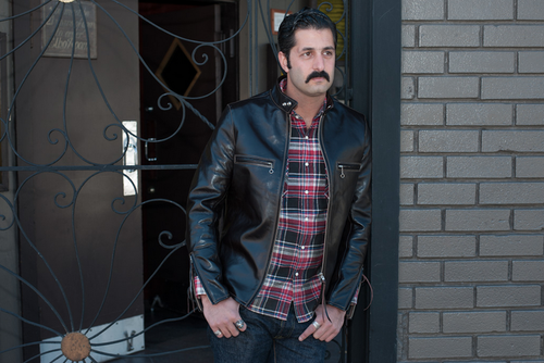
There must be some cruel cosmic law that puts everything we covet just outside of our reach. It doesn’t matter what your budget is. If you’re used to spending $200 on something, the thing you’ll want most will cost $300. If you’re used to spending $1,000, the most desirable item will cost $1,500. I was reminded of this when I stopped by Self Edge recently to try on some new jeans. While aimlessly browsing around, I also found a couple of great leather jackets, the star of which is this black cafe racer by The Himel Brothers.

Cafe racers are simple, single rider jackets with stand up collars, two to four slash pockets, and zippered sleeves. Although they were originally designed for just motorcycle use, they eventually came to symbolize American ideals of freedom and rebellion. Naturally, with social appeal came fashionable imitations, which is perhaps why Bruce Boyer once said that black leather jackets are just shadows of their former selves, “diluted to the point of mere role-playing.” That’s undoubtedly true, although I admit that doesn’t stop me from still liking them.

The Himel Brother’s cafe racer is made from a unique front quarters horsehide sourced from the Shinki tannery - the same Japanese tannery that supplies the great John Chapman. It’s a thin leather - much thinner than the horse or cowhides you’d typically find on the market - and consequently also much lighterweight. The semi-analine, vegetable tanned skin has been finished with a thin layer of wax coating, which presumably will give the leather a really nice “vintage” look once the jacket has been broken in. Other details include leather strips hung from the zipper pulls and a tiger camo lining in the interior. I’d normally find camo lining to be a bit cheesy, but I rather like it here. When worn, it gives the jacket a nice bit of rugged detailing. 

Unfortunately, it costs $1,950, and when I saw the price tag, I did one of these. Even more sadly, Self Edge never holds big sales. They have two a year, usually at a discount rate that matches the year’s number. So in 2012, they had a sale for 12% off; in 2013, it was 13% off; and this year, it’ll probably be 14% off. At that rate, I can probably afford this jacket in 2050, assuming it and I are still around. On the upside, The Himel Brothers has this same model, in limited sizes, at a slightly lower price on their website (they typically do custom orders). However, those will be made from different materials (presumably heavier and more traditional, which may be a good or bad thing, depending on your taste) and won’t have the same details.

Keep reading

New London Lounge Deliveries

image


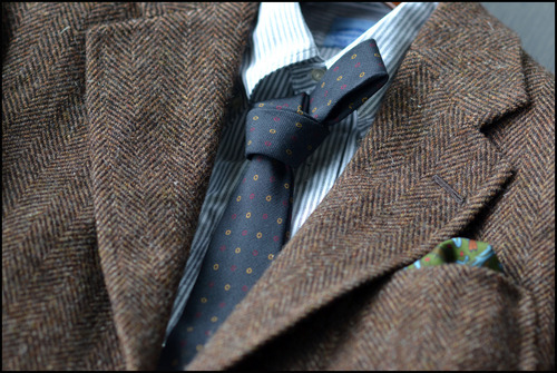
I recently received two new London Lounge fabrics, which is great timing because Steed will be touring the US next month. Included in the shipment was a brown Shetland herringbone, with qualities that I’ve found impossible to get elsewhere. Spongy and light in the hand, it has the large enough pattern to distinguish it as a true herringbone when worn. I’ve put down two other swatches below for comparison – one from Abraham Moon and another from a mill I no longer remember. Most herringbones you’ll see today are like these (either in cloths or ready-made garments). They’re often too smooth, too red, too yellow, too dark, too light, too muddled, or most of all, too small in pattern. This one, in contrast, is perfect. It’s thick, heavy, and tweedy, and carries just the right combination of mid- and dark-browns to make it look rich and earthy. My photos unfortunately don’t do it justice. You should rely on the first photo below (supplied by The London Lounge) and Voxsartoria’s picture above for more accurate representations. The cloth is truly fantastic.

The second is a cream and brown glen plaid that was modeled after a jacket Gianni Agnelli was often seen wearing. This too has a large-scale pattern, although this time it’s aggressive enough to give me reservation. Large patterns have the advantage of helping distinguish odd jackets as true odd jackets (rather than suit jackets), but once too large, it can start looking like a horse blanket. I’m slightly afraid this is too big for my frame, although photos of Agnelli and Alden in theirs make me consider otherwise.

In any case, there was some debate on the forums recently about whether London Lounge fabrics are worth their premium. Most jacketings cost about 150 GBP, which is a good 50% to 100% more than what you’d expect to pay at a standard English mill (assuming you even have to take cloth prices into account at the tailors, which you often don’t have to do). I won’t rehash the discussion, but suffice to say, I’m a happy paying customer. I’ve yet to find suitable alternatives to Michael’s cloths, and find a lot of value in having someone trim the wide world of books for me to a manageable selection. Plus, it’s difficult to find cloths made in these heavy of weights anymore – useful if you want the kind of drape and shaping seen in old suits

– without crossing over into overcoating territory. I’m already looking forward to the next round of subscriptions.  

Keep reading

A Post That Will Please No One

image


This post is sure to please no one. Not traditionalists who have no interest in anything outside of a coat and tie. Not workwear purists who dislike any kind of pre-distressing. And certainly not anyone who knows the name of this blog, who will rightly wonder why they’re reading about workwear on a site called Die, Workwear! But, so it goes …

Lately, I’ve been really impressed with Chimala. It’s a Japanese line that started in 2006, originally with a focus on women’s collections, but has recently expanded into menswear. Pants tend to fit a bit loose and full, and have a casual, carefree sensibility that I think is refreshing today’s skin tight fits. Coats and shirts are a bit slimmer, with the second being more so than the first. The line is slightly reminiscent of Japanese brands such as 45rpm, and will probably appeal to the same fan base.

Unfortunately, the nicest aspects of Chimala’s line – the subtle detailing and fabrication – don’t come through well in photos. Like the new Barbour Beacon collection, which is now designed by Norton & Sons’ Patrick Grant, these are clothes you have to handle in person to appreciate. This last season, for example, they made a navy shirt jacket from a really interesting wool/ nylon material. The fabric had a nice spongy feel to it, and seemed well suited for transitional weather. There were two side-entry pockets at the front with reinforced stitching, elbow patches at the sleeves for detailing, six corozo buttons for front closure, and a drawstring hem which, from what I could tell, was mostly for decoration. I really wanted to purchase it for wear with casual chinos, but figured nobody would pay the full retail price of $400. “I’ll smartly wait until it goes on sale, and get it at 40% off,” I thought. A week or two after first seeing it, my size sold out, and most of the remaining sizes went quickly after that.

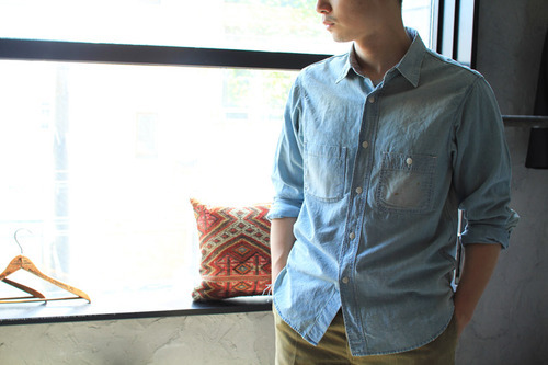
There was also a really nice chambray shirt with many “standard” vintage details - vintage style buttons, triple needle construction, and run off chain stitching at the hem. Two pockets decorated the chest, with non-wonky cuts for people who are a bit tired of the strange designs that adorn shirts these days. The only controversial thing is the finishing. The shirt had been heavily washed and pre-distressed, and there was “faux darning” at the collar and one of the cuffs, which you can sort of make out in this photo. Light brown staining had also been applied to one of the chest pockets.  You can see similar details in their women’s line, such as this chambray shirt reviewed by Archival Clothing.

Keep reading

Quality in Alligator and Crocodile Leathers

image


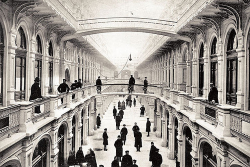
There’s a building in Moscow called GUM (pronounced “goom”) that sits in the city’s historic Red Square. It’s massive, running alongside the square, and vaguely resembles some of London’s old railway stations. It was built in the 19th century as a marketplace, and held over a thousand stores at the peak of its operation. After the Russian Revolution in 1917, the building was nationalized and the stores were taken over by the state through Lenin’s New Economic Policy. That unfortunately failed, so under Stalin, the merchants were kicked out completely and the building was converted into office space for the ruling Communist Party.

Since the end of the Second World War, GUM has slowly moved back to a private business model, and today is basically a shopping mall for Russia’s elites. The Russians have a funny saying about the place – that it’s an “exhibition of prices” since few people can actually afford to buy anything there. GUM holds stores such as Cucinelli (where I once tried on a pair of sweatpants that cost several thousand dollars), Hermes, and John Lobb. It’s funny to me that, today, if you stand in Red Square, you can see almost all of Russian history by just sweeping your head from one side to the other. There’s Saint Basil’s Cathedral representing “pre-modern” Russia; Lenin’s tomb representing the Communist era; and GUM, which is essentially a mall for today’s Russian oligarchs.  

Anyway, setting my political views aside, it’s in GUM where you can also see some of the finest alligator and crocodile leather products in the world. The rule of thumb for such exotic leathers is simple: you generally want evenness in the scales, and clean, crisp lines. But to actually see something exhibit these qualities is its own education completely. 

Take these two belts, for example. The top one is made by Bertrand Montillet, a former Hermes craftsman who lives in Paris and now privately produces bespoke commissions for clients. The bottom one is just some image I found online, but you can find similar belts on eBay or any thrift store. The quality difference between the two is obvious. The first has beautiful, clean lines and the second looks wrinkled and cheap.

Keep reading

Unfortunately, They’re Not That Floppy

image


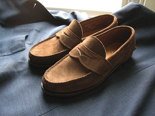
Everyone seems to want things custom-made these days, but there’s an advantage to ready-made that’s rarely talked about. With ready-made, you can more easily see what you’re getting before you pay for it. I was reminded of this when I recently received a pair of made-to-order loafers from Rancourt. These are their pinch penny loafers – moccasin constructed, with a handsewn strap, hard leather bottom, and unlined leather uppers. The term “unlined” here is a bit of a misnomer, because few shoes are truly made without any lining. Like with neckties, “unlined” in footwear typically means there’s just less lining, not that there’s no lining at all.

To explain, well-made shoes often have a full leather liner built in, so that two layers of leather are joined together to form the upper. This gives the shoes more support and structure, so that they hold their shape better over time. I wanted an unlined shoe, however, to feel like Alden’s unlined penny loafers. Those are floppy, soft, and feel like slippers. Those who’ve worn them know how comfortable they are. The problem is that they have a skin stitched detailing at the toe, rather than a genuine moccasin stitch. This means a single piece of leather is pulled over the last, and then a “skin stitch” is made at the toe for decorative effect. A genuine handsewn, on the other hand, is made with at least two pieces of leather – one forming the sides of the upper, and another for the vamp – with a handsewn saddle stitch to join everything together. That’s the moccasin style Maine producers are known for, and to my eye looks more pleasing for such a casual style shoe.

I told Rancourt I wanted something unlined so that it would be floppy and soft like Alden’s model, so they recommended their Orion suede leather. But when the shoes arrived, they weren’t floppy at all. “Unlined,” to be sure, but they’re soft in the way that any “unlined” boat shoes or camp mocs would be. It was a bit of a let down.

Still, they’re nice shoes, and appreciably more American than my English loafers. I think I’ll enjoy wearing them this spring with oxford cloth button down shirts, cotton trousers, and Shetland sweaters. It’s just unfortunate they’re not that floppy. 

Keep reading

Thankfully, It’s Not That Soft

image


The last couple of years haven’t been kind to Scottish cashmere. The recent buyout of Barrie Knitwear and the shuttering of Caerlee Mills reminded me that I ought to get what I can before things disappear. So, last fall, I placed an order for a custom cable knit through William Lockie. This is the same as their Chirnside model - a four-ply cashmere crewneck – but made to slimmer specifications than what’s offered as stock.

The term “ply,” as many will know, refers to the number of strands twisted together to form a single yarn. An “unplied” yarn has no twist, either because it has not been spun or because it’s been made by extrusion. The greater the number of plys, the thicker the yarn. A thicker sweater will naturally be warmer, but it will also be harder to layer underneath sport coats. Generally speaking, a two-ply knit is good for wearing with tailored jackets, while something like this four-ply is better worn alone or underneath casual outerwear.

In any case, the sweater arrived last month, and I’ve been wearing it regularly. On first impression, it seems to have some of the qualities of the much fabled, old Scottish cable knits – the stuff made prior to the 1990s and said to be hardier than the sweaters produced today. Modern cashmere is often heavily milled in order to achieve a fluffy, cloud softness, but this also weakens the yarn, which is what leads to pilling. This Lockie, in contrast, is made from pure cashmere, but feels more like regular wool, much like the old stock cashmeres I once handled at Cable Car Clothiers. That is, it’s soft, but not silky, fluffy, cloud soft like the stuff you might find in an Italian luxury house.

I’ll wear it for a year and see how it fares. Lockie sells their knits through their online store Heather Wallace. The standard make only comes in five colors – blue-mix, navy, flannel grey, lovat green, and linen – but if you order something custom, you can choose any of the yarns listed in their Melrose model. If this navy cable knit holds up well after a year, I think I’ll order three more in bottle green, linen, and flannel grey. I’m hopeful this one will turn out well, for thankfully, it’s not that soft. 

Keep reading

Winter Boots

image


I’m heading off to Canada for the holidays, where there are real winters. San Francisco has been rather mild this season, save for one bitter cold spell, but in Canada, it starts to snow in December. It doesn’t get as bad as Russia, but it gets bad enough to need real winter boots. 

Two that I’m bringing are these by James Purdey & Sons and Edward Green. The Purdeys are field sport boots originally meant for hunting, but I think they make for excellent general-purpose boots when the weather turns foul. The bottoms have studded Dainite rubber soles for extra gripping, and the bellow tongues help prevent water from leaking around the laces. The only problem is that they take a while to put on. The speed hooks are a great help, but you still have to explain to any company you’re with why you have to buckle down four straps when you’re both just going out to grab some quick lunch. Luckily, that extended shaft, which comes about mid-calf, gives some excellent added protection should you have to face cold shoulders.

The other pair of boots is Edward Green’s Galway made from the company’s walnut country calf (the rustic version of their dark oak leather) and built on their 64 last, which they originally developed for Holland & Holland’s shooting boots. The insides have been specially lined with shearling so that, when you have thick socks on, your feet never have to know what season it is. Pete, my e-friend and co-writer at Put This On, recently called them “Eddy Green Uggs.”

What I like most about these boots is that all their special detailing - the buckle straps, bellow tongues, and shearling linings - are hidden when you actually have the shoes on. When worn, they look like any other suitable winter boots from a Northampton maker. They’re unique without having to scream so. Plus, they just feel incredibly sturdy and tough, making you feel ready for any Canadian weather. 

Keep reading