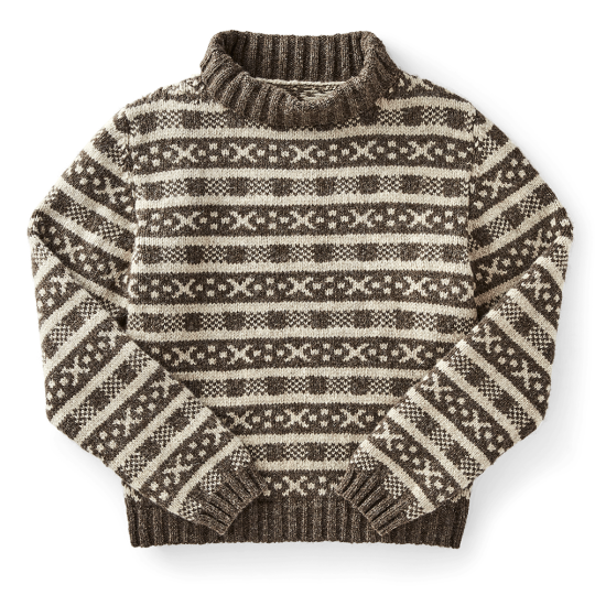
Over at J. Crew, you can find over fifty shades of grey, ranging from “obsidian” to “vintage dove.” The company describes their granite-colored Ludlow suits as “coal,” but that color shouldn’t be confused with the cooler, stone-like shade of their 9″ tech shorts, which are also labeled “coal.” Neither of those should be mistaken for J. Crew’s “Bedford coal,” which is different color entirely. In the past, the Americana outfitter has used all sorts of exotic names to describe very ordinary colors. There’s been “dried fig” (green), “surplus grass” (also green), “natural kale” (again, green), “spearmint sprig” (once more, green), and “fresh water” (blue). Reading through these colorful words, you’d struggle to know whether you’re scanning a J. Crew catalog or a farm-to-table menu at a hip Brooklyn bar-restaurant.
To help eliminate the confusion, some people have tried to standardize the ways in which we describe color. Albert Henry Munsell devised a three-dimensional mapping system for color in the 1880s. A. Maerz and Mr. R. Paul built on Munsell’s work but also incorporated common names for various hues and shades. They published their book A Dictionary for Color in New York in the 1930s. Across the pond, the British Colour Council produced a series of color indices from the 1930s through the ‘50s. Their first book, a two-volume set titled Dictionary of Colour Standards, was published in 1934. The Council hoped that it would do for color what “the great Oxford Dictionary has done for words.” The book “would mark,” they wrote, “the great achievement of modern times in assisting the British and Empire industries with colour definition,” thereby giving the British trades a competitive edge.
Shortly after the book was published, The Dictionary of Colour Standards was used as the official reference everywhere from the Royal Horticultural Society to the British Army to the Royal Institute of British Architects. Dermatologists, art curators, and map printers relied on the dictionary to produce important documents. Part of their success was due to the fact that they labeled every printed plate with an evocative name and reference number, much like you’d find in a Pantone guide. They also included fabric swatches for textile designers. Chartreuse, after all, registers sightly differently on paper than it does on fabric. So for the first edition of their book, the Council included carefully dyed silk ribbons. The follow-up edition, released in 1952, came with woolen yarns.
If you think J. Crew’s copywriters are inventive, get a load of British color experts in the 1930s. The Dictionary had 220 colors with wildly imaginative names such as Larkspur (“No. 196”), Forget-Me-Not (“No. 84”), and String (“No. 127”). Some names reference flora and fauna, such as Bee-Eater Blue, Horse Chestnut, and Squirrel. My favorite is Kermes, one of the oldest natural coloring agents. In ancient times, this was known as “King’s Red” because of how it was used to dye royal European robes. To get the vibrant red dye, which was prized because it was colorfast, silk weavers crushed the desiccated bodies of a parasitic insect known as Kermes, hence the color’s name. Since the eggs resemble fine grains of wheat, we get the phrase “dyed in the grain.” And from Kermes, we get the word crimson, the most striking shade of red today. During the Middle Ages, Kermes dye was so esteemed, landlords accepted it as payment for rent.
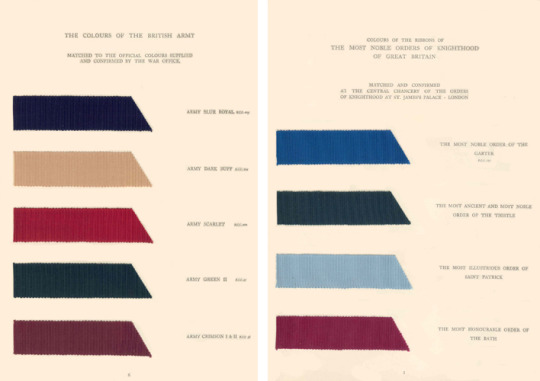
In 1937, the Council was called upon to produce a new set of books to commemorate King George VI and Queen Elizabeth’s coronation. These books were to be a guide on the traditional colors bound up with British history, as well as serve as a reference guide to help organizers decorate the streets of London. “Our national pride and patriotism demand that we should cherish these colours as part of our national life and preserve them in all the freshness and beauty of their original state for future generations,” the authors wrote in the foreword. “Of many of the colours, strange and wonderful tales are told, stories which stir the imagination and recall the glories of the past. Something of the meaning and history of these colours is given in the following pages, while the actual colours have been faithfully reproduced on ribbon from actual records of flags, banners, and orders preserved throughout the ages.”
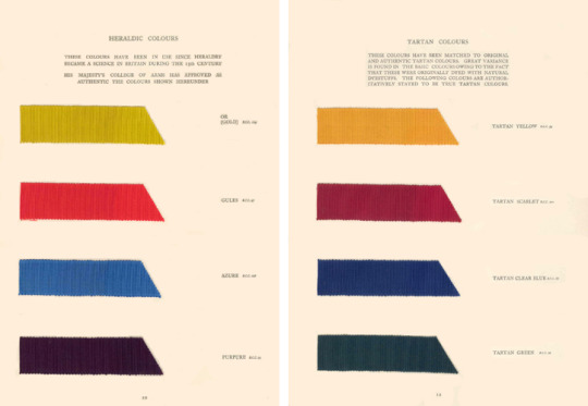
What a beautiful set of colors, and even more colorful set names. For the page cataloging the colors of knighthood, we have “The Most Noble Order of The Garter” (blue), “The Most Ancient and Most Noble Order of The Thistle” (green), and “The Most Honourable Order of The Bath” (red). The authors tell us that they’ve carefully matched the two pages of tartan colors to original and authentic tartans. However, since the ribbons have been dyed with natural materials, there’s some variation from book to book. The distinctive, dark shade of green you see above was derived from various shrubs and flowers, including broom, heather, and buckthorn. Yellow was taken from vegetal sources such as ash, sweet gale, and teasel; red from alder bark, rue, and privet.
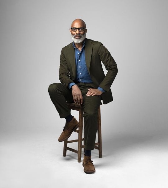
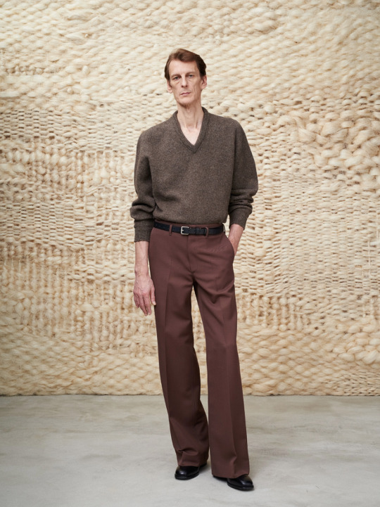
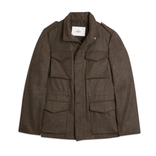
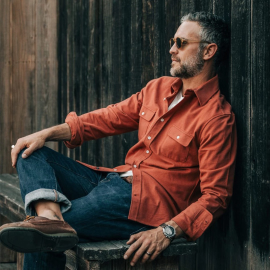
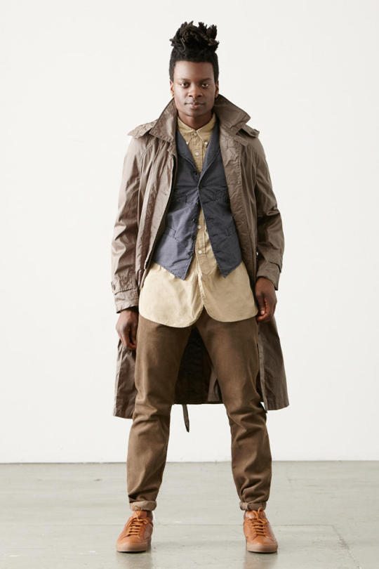
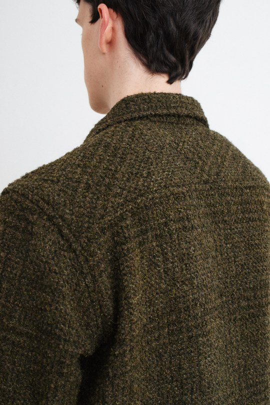
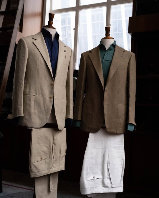
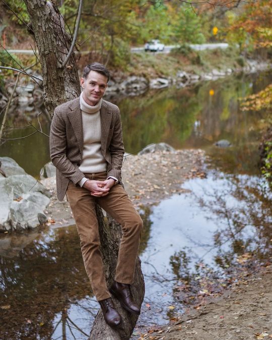
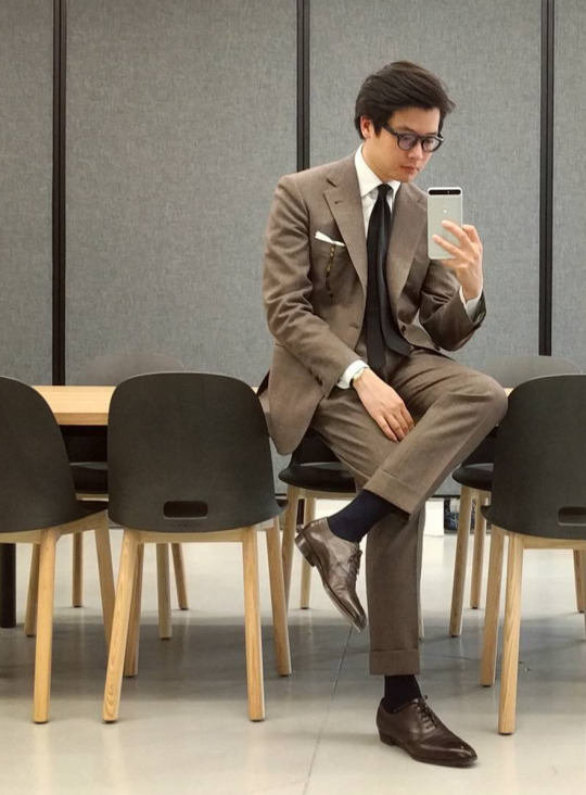
With spring around the corner, I’ve been thinking more about color. Unfortunately, men are mostly limited to earth tones, such as grey, brown, and blue, but their seasonality swings on their exact shade, hue, and intensity. This is the great lesson from the Council’s Dictionary of Colour Standards, which showed that brown isn’t just brown, and blue isn’t only blue. If you’re looking for some spring/ summer inspiration, here are three colors I’m excited to wear this season, along with their very strange histories.
THE AVERAGE COLOR OF A FRENCH MOLE
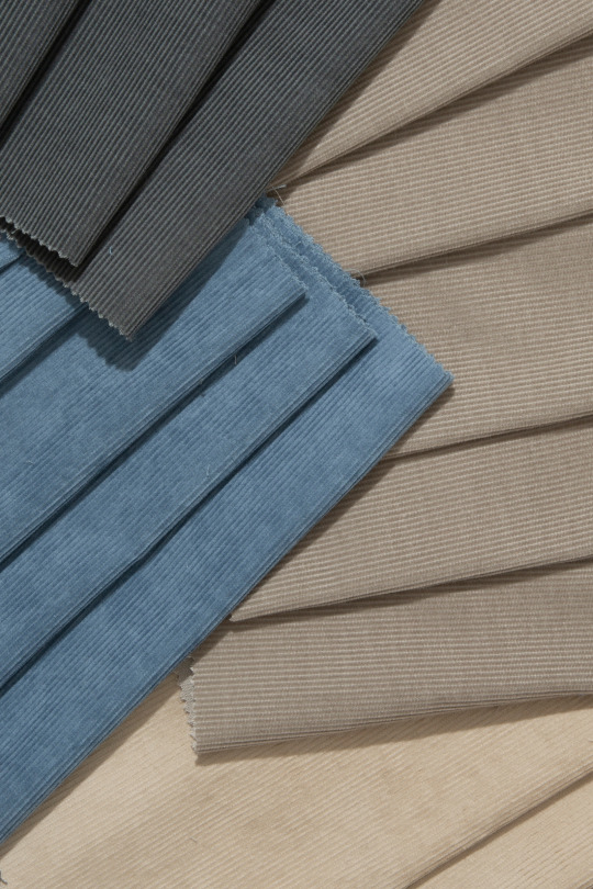
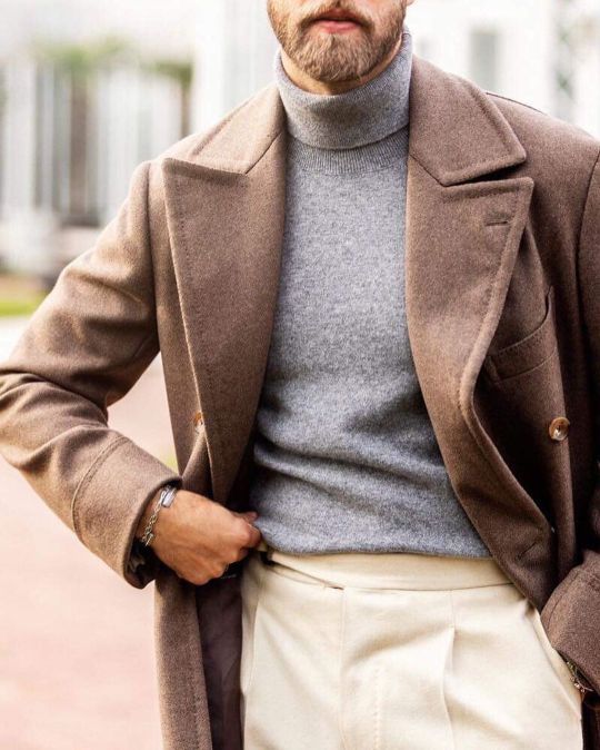
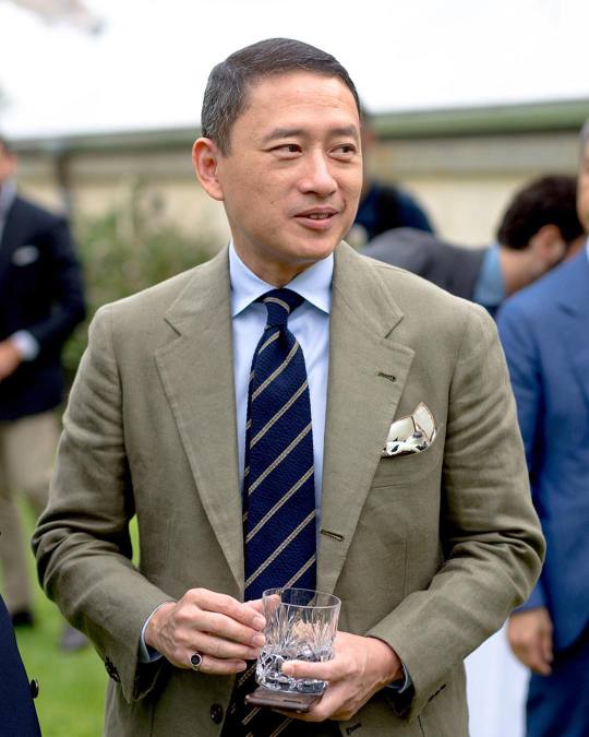
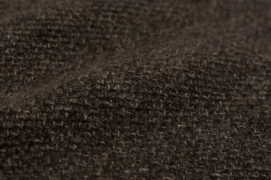
Color research is no easy task. For one, you have to link it to how the public generally understands color, so that your language is easier to adopt. A color that has historically vexed researchers is taupe. The British Colour Council, for example, labored for eighteen months to get the Dictionary of Colour Standards right. They chased down and collated color terms, produced samples, and researched the ways they could keep colors stable when they knew hues and shades can alarmingly morph from one decade to the next. But they struggled with taupe because, in some records, it veers on a cool side of brown, while others have it as a brown side of grey. As a French term for “mole,” the only real consensus is that taupe should resemble the burrowing animal, but how it’s expressed in practice varied from source to source.
To pin down taupe, the two authors of A Dictionary of Color set out on a worldwide expedition to look at specimens from the genus Talpa. They visited zoological museums in the United States and France to handle actual, living moles. Let’s imagine this: these two men flew around the world on a wild mole chase so they could more faithfully represent the color taupe. “Its color certainly varies,” they concluded, but from their research, they found that taupe is generally browner than any mole had the right to be. The sample they included in their book, therefore, was “a correct match for the average actual color of the French mole.” (Why the American mole was left out of this calculation is something for a Ph.D. dissertation. Personally, I think it’s unfair and perhaps not very inclusive of American moles).
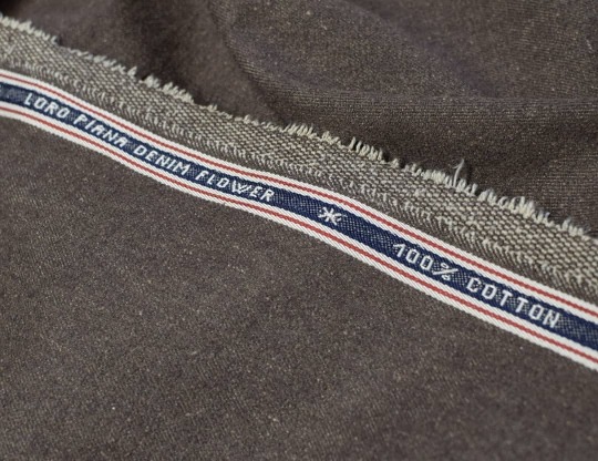
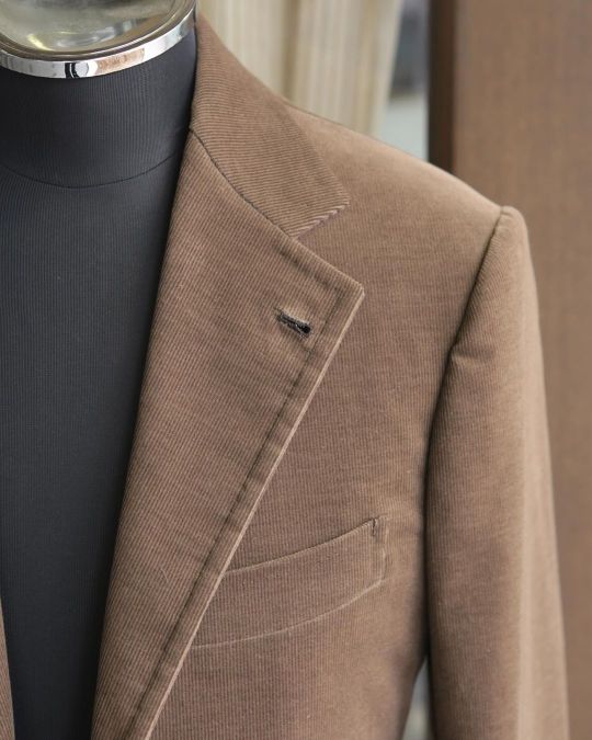
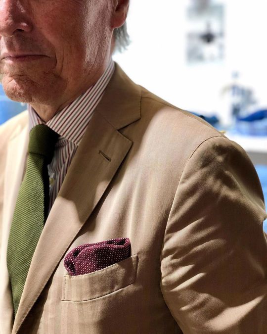
A few months ago, when Salvatore of I Sarti Italiani was in San Francisco for a trunk show, I search for this exact color above. “I’d like a taupe cotton suit,” I told Salvo. He didn’t understand the English word taupe, however, so I explained I wanted to look like a furry little mole. “Ah, yes,” he said. He then handed me the fabric book for Zenga’s cottons, where I found two options. I choose the one that looked closest to the photo of a French mole on my iPhone screen.
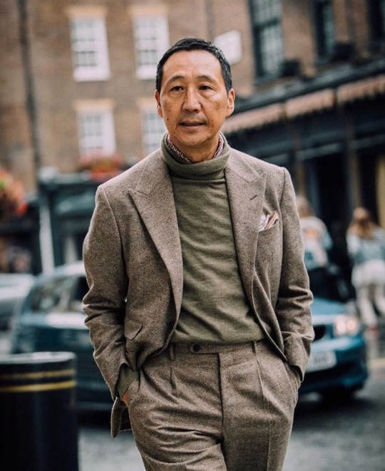
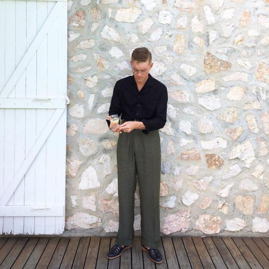
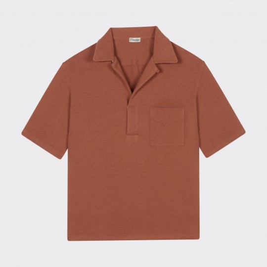
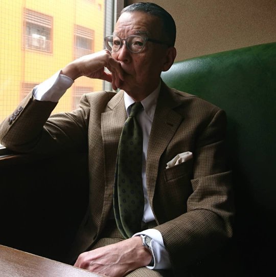
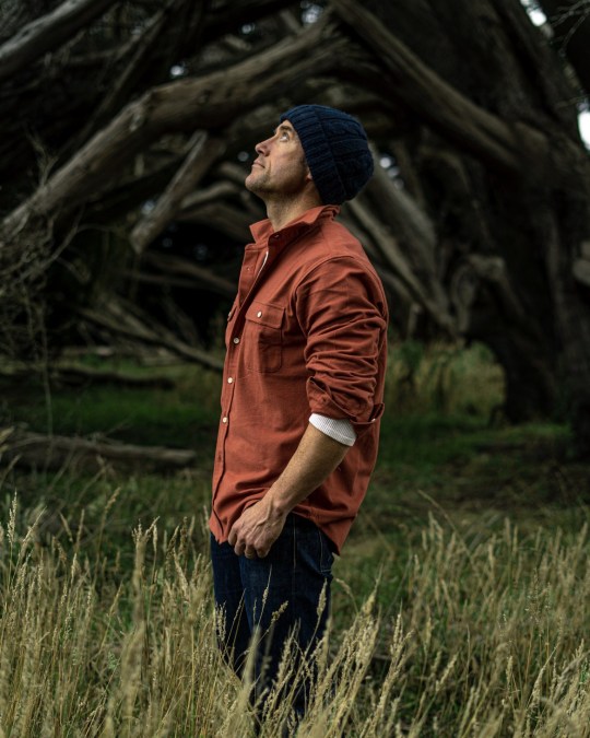
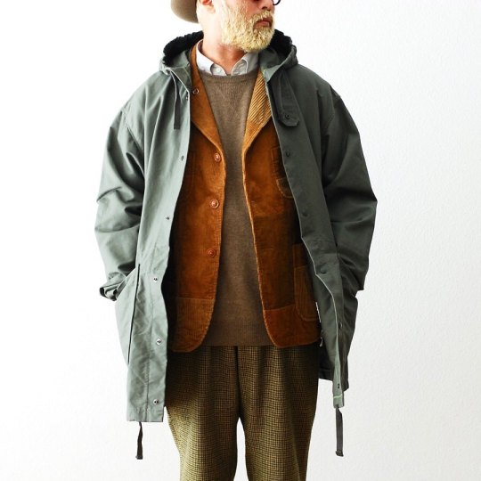
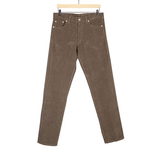
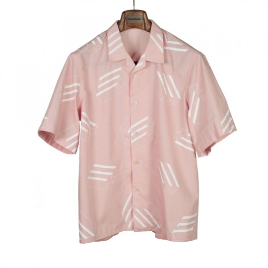
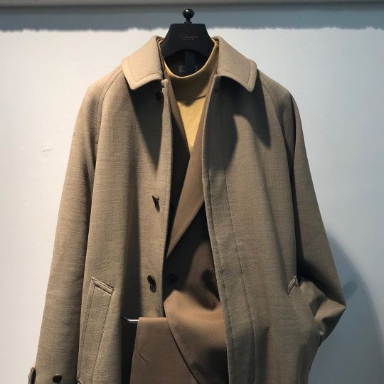
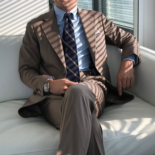
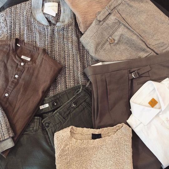
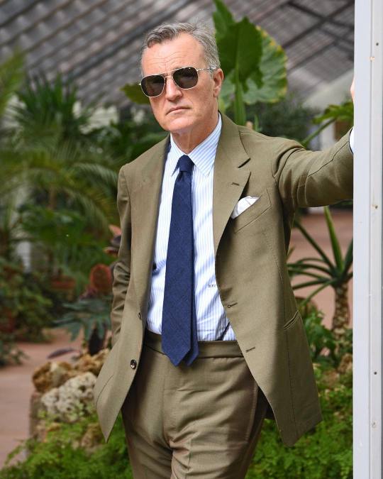
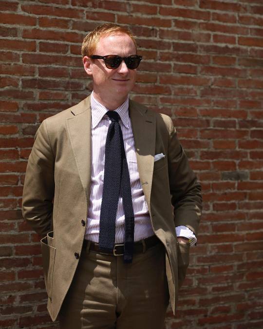
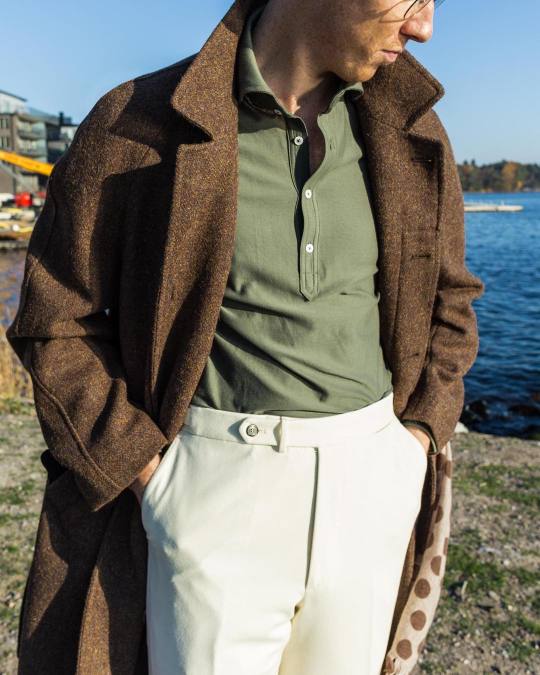
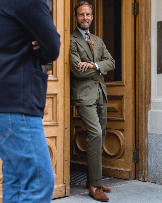
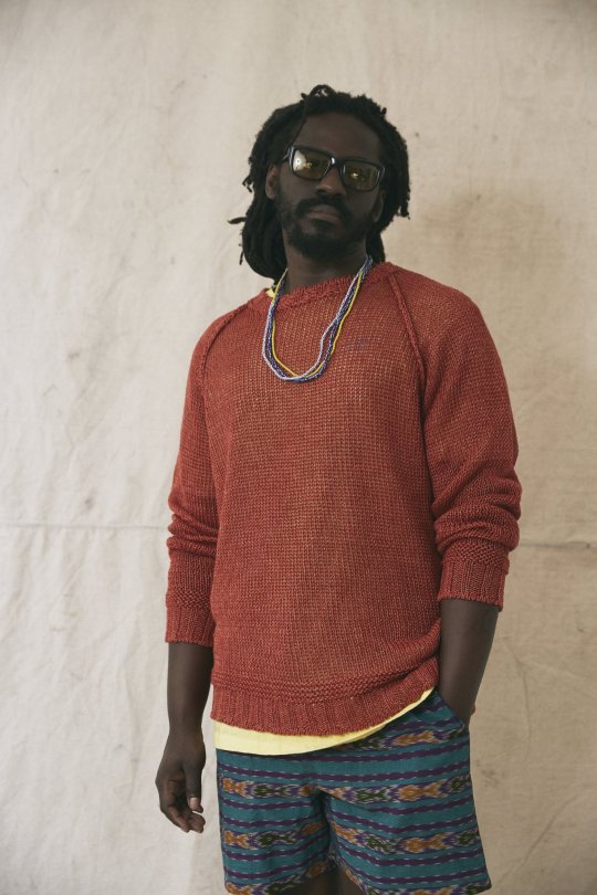
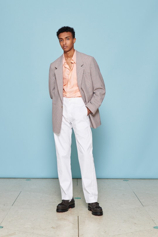
Taupe is the perfect spring/ summer color. It’s soft enough to feel like a pastel, but also masculine in that it relies on the same grey-brown hue that should be familiar in most menswear wardrobes. You can wear it with light blue shirts or deep navy polos, pair it with spring green accessories or bright white sneakers. The color works just as well in traditional tailoring as it does in designer clothing or streetwear. Stoffa and Robert Geller often use taupe in their presentations, while Kanye heavily relied on it for his second Yeezy collection. In a blog post at No Man Walks Alone, a sponsor on this site, menswear writer Daniel Penny described taupe as “not quite brown, not quite gray –- a chameleonic color of surprising versatility.”
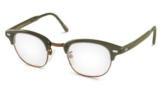
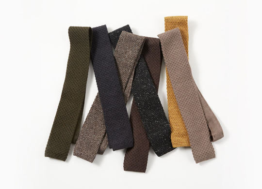
Taupe Options: Doppiaa Western shirt, Rota Fresco trousers, Jacques Marie Mage sunglasses, Our Legacy sweatshirt, Saman Amel sweater, Stoffa flight jacket, Stoffa knitted shirt, Master Piece card case, Kleman Tyrolean shoes, HN White Irish poplin tie, The Armoury double-breasted suit, The Armoury sport chinos, Dehen Crissman overshirt, Dapper Classics herringbone socks, Alpha Industries x 3sixteen iron dyed chinos, SEH Kelly tuck-stitch sweater, SEH Kelly Balmacaan coat, Taylor Stitch herringbone shirt, and Anglo Italian striped knit tie
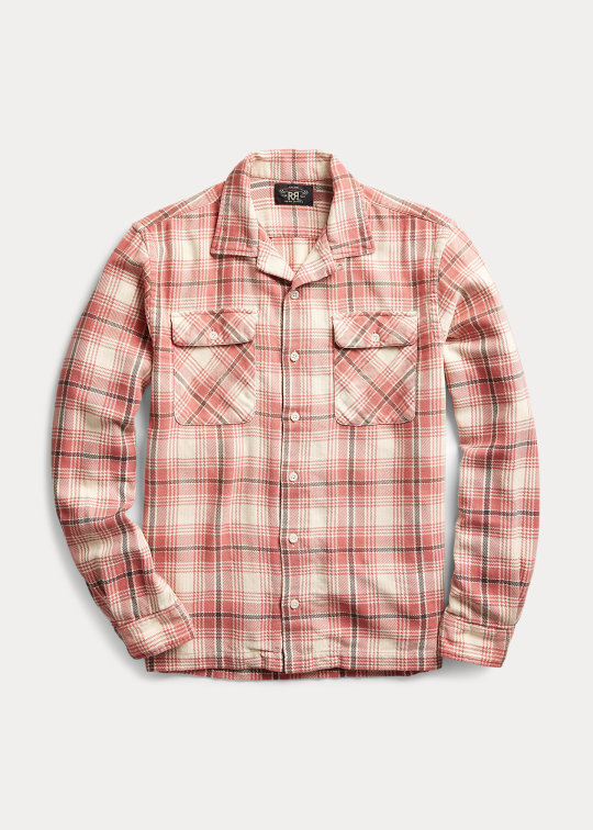
PRISONERS AND BAKER-MILLER PINK
In the 1970s, when American cities were beset by wave after wave of drug epidemics and spiking violent crime rates, a professor named Alexander Schauss was researching the connection between emotional states and color. Schauss’s research followed in the footsteps of Max Luscher, a Swiss psychiatrist who believed that a person’s color preferences could provide clues about their psychological state. The idea is that changes in the endocrine system, which produces hormones, correspond with how that person feels about color. If this finding is correct, Schauss postulated, then the reverse might also be true. If you show someone a certain color, can you trigger profound changes in their endocrine system, thus altering their psychological and physiological condition? Can you use color for mind control?
To test this, Schauss mixed one gallon of pure white indoor latex paint with one pint of red trim semi-gloss outdoor paint to produce a soft hue of pink that he called P-618. He then gathered 158 young men as his test subjects. Half of them were asked to stare at a deep blue, 18 x 24-inch piece of cardboard for one minute, while the other half at a pink piece of cardboard of the same size. Of the men who were shown pink, all but two exhibited a lower heart and respiratory rate, as compared to people who were shown the other color. Intrigued, Schauss tested another 38 men to see how pink would affect someone’s strength. Using a dynamometer, Schauss found that pink did for every man what a haircut did for Samson — it made them weaker by about 6 to 23 percent.
Every social researcher struggles with the same question: how do you know if your lab results have any implications in the real world? To find out, Schauss convinced the directors at a Naval correctional institute in Seattle, Washington to allow him to paint their holding cells to see if it would affect inmates. Before this, violence at this facility was a “whale of a problem,” reported one of the directors. But after the cells were painted in this Pepto-Bismol shade, there wasn’t a single incident over the next five months. Similar results were reported at the Kuiper Youth Center in San Bernardino, where Dr. Paul Boccumini happily reported, “it has worked so well that the staff must limit their [delinquents’] exposure because the youngsters become too weak.” These experiments were so famous, the color was soon christened Baker-Miller Pink, after the commander (Baker) and warden (Miller) of the original Seattle-based correctional facility.
Naturally, there was an academic backlash. Over the next decade, academic researchers failed to reproduce the same striking results. They measured the effect of pink on everything from anxiety levels to blood pressure to coding ability, and results were mixed. A 1988 study didn’t find any relationship between exposure to color and blood pressure or strength. Still, they did find that people were quicker and more accurate in various neuropsychological tests. Another study, carried out on prisoners and male university students pretending to be prisoners, found that exposure to Baker-Miller Pink reduced the amount of time it took for them to become calm.
Although the Baker-Miller theory hasn’t gotten very far in academic research, it crops up from time to time because it makes for fun pop psychology. For a while, some American college football teams painted their visiting team’s locker rooms pink as a way to gain an unfair advantage. This continued until the league institute a rule that both home and visiting team locker rooms have to be the same color. A few years ago, Kendall Jenner said she painted her living-room wall pink because the color is “scientifically proven” to suppress appetite. The press, rightly, called her diet plan rubbish.
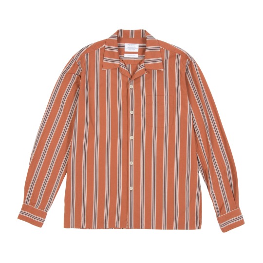
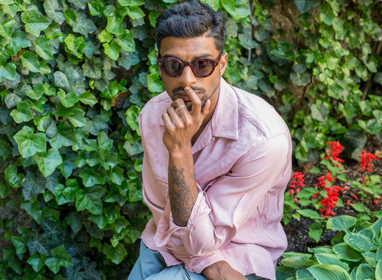
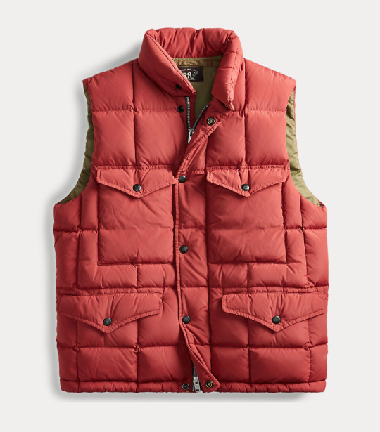
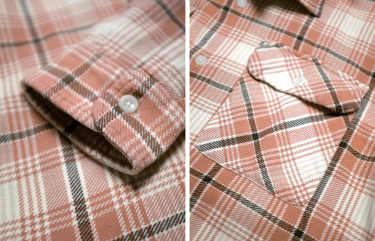
Pink, however, is a great way to add a touch of cheerfulness to almost any outfit, which is what you want for warm-weather days. A striped pink shirt can be an excellent way to enliven a navy sport coat and grey trouser outfit, whereas pink plaid flannels can be teamed with blue jeans and black Bundstones (a combination I’ve been wearing a lot lately). As a color, pink plays well with navy, olive, tan, white, and soft pastel hues. I recently bought this pink plaid RRL flannel, which has just the right dusty shade and boxy fit. I’m not sure Baker-Miller Pink drains anyone of energy, but if you ever get into a fight, maybe you’ll have an edge. Just don’t look down.
Pink Options: RRL camp shirt, Michael Spencer striped oxford, Propter Cloth faded rose seersucker, Camoshita terry cloth polo, Camoshita terry cloth t-shirt, Berg & Berg socks, Velva Sheen pigment-dyed t-shirt, and Todd Snyder camp collar shirt
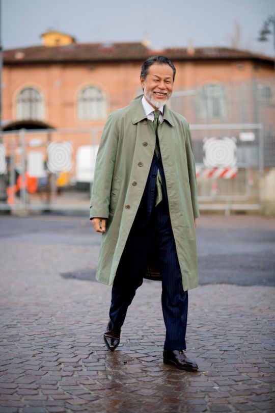
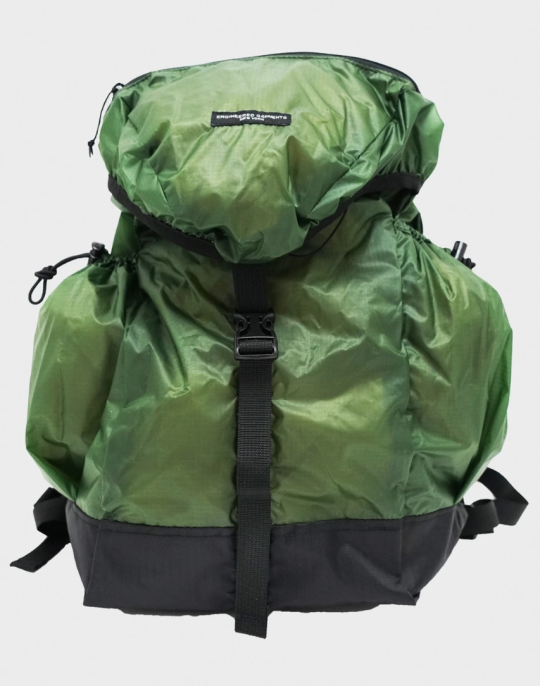
THE CELADON GLAZE
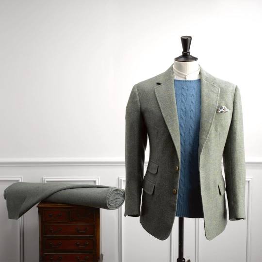
For centuries, the Chinese have produced a special kind of stoneware that’s instantly recognizable from its pale jade-green color. Artisans create the color by painting biscuit-colored pottery with an opaque glaze that has just a touch of iron oxide. The pottery is then placed inside of a kiln that’s been fired up to about 1200 °C degrees. By varying the temperature, along with the strength and timing of the oxygen reduction, an artisan turns that opaque glaze into a beautiful, lustrous, pale green finish. However, the amount of iron oxide in the glaze to be just right. Too little and the glaze turns blue (sometimes the desired color). Too much and it’s olive or black.
In Europe, this kind of stoneware is known as celadon, which takes its name from the shepherd Céladon in Honoré d’Urfé’s French pastoral romance, L’Astrée (1627), who wore pale green ribbons. During the 17th century, when this stoneware first made its way to Western Europe, Europeans were too far at the end of a series of torturous trade routes, and too distant from the source of these creations, to understand celadon’s myriad of classifications. But they did find these sea-mist ceramics to be beautiful, and the fact that they had traveled so far only reminded them of the hapless romantic Céladon in his shabby coat of green.
Song-dynasty celadon has been found as far-flung as Cairo and Japan, while Turkish rulers once believed celadon was a natural antidote for poison. Like the more fragile variants of dried tea leaves, the Chinese tended to keep the best versions of these things for themselves. One variant of celadon, known as mi se or “mysterious color,” was so exclusive, it was kept inside of royal households, and few outside of the court could see it. Tenth-century poet Xu Yin artfully guessed that the color was like “carving light from the moon to dye the mountain stream.” I admittedly have no idea what that means, but it vaguely sounds like some eBay descriptions I’ve read.
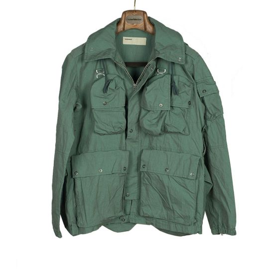
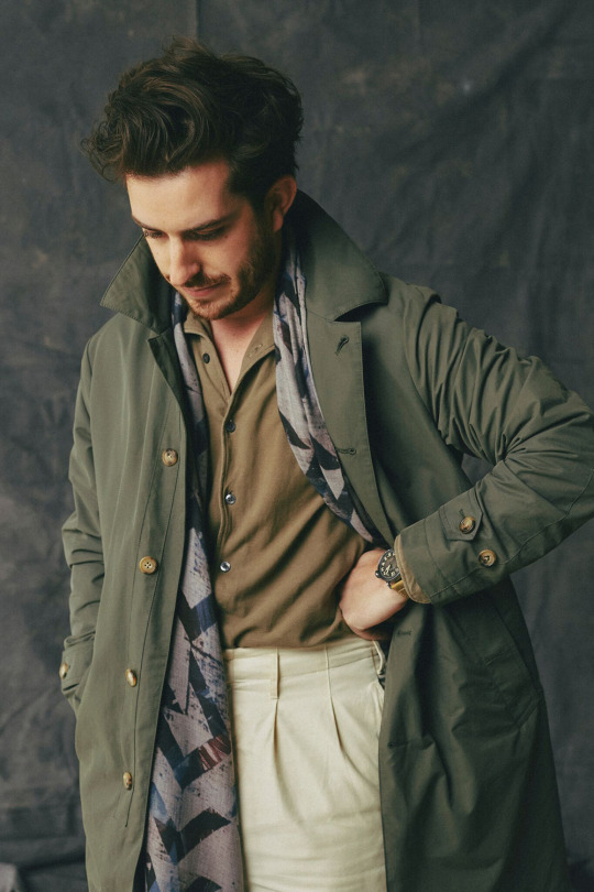
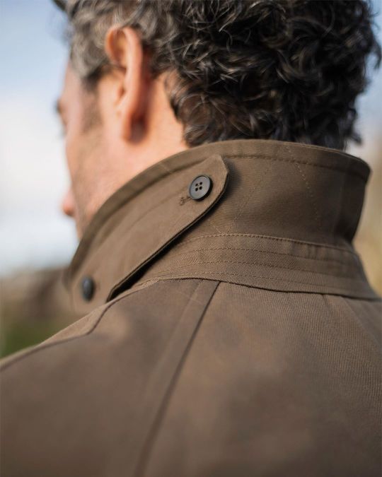
This pale green shade is also an excellent color for wardrobes. It’s not so much of light green as it is an earthy green that’s been mixed with grey and then drawn down to a low tinting strength. As a naturally occurring pigment, it feels just right for springtime. It pairs well with buttery colors such as cream and chestnut, acts as a foil for vivid colors such as sunshine yellow, and pairs well with the earth tones that dominate most men’s wardrobes. I like it in the form of chinos, fatigues, and yes, even cargo pants. It works exceptionally well in tailoring, particularly with soft cotton suits. I also find the color works well as an accent, particularly workwear-styled ball caps, which can complement denim truckers and ranch jackets. For those who are just starting to spin around the rest of the color wheel, this pale grey-green shade is a safe and reliable starting place.
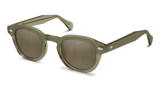
Celadon Options: Kaptain Sunshine shorts, Phlannel chinos, RRL cargo pants, Papa Nui Pierce cap, HN White wool-silk-linen tie, Camoshita shirt jacket, Wallace & Barnes M-51 jacket, Wallace & Barnes chinos, Wallace & Barnes camp shorts, Eastlogue Trekking jacket, 3sixteen quilted jacket, Dapper Classics socks, Todd Snyder utility shorts, Drake’s covert cloth suit, and Moscot eyewear